RT
Starting off our thread continuing the theme of screens,
surveillance, and inherent vice from our earlier public
conversation this past spring... During yesterday’s phone call we
began to explore the relationship between images and text. Perhaps
this is getting a bit meta, but given the nature of our submission
for this publication I want to kick off our dialogue with an
inquiry as to your thoughts on close looking and how you think the
scaffolding of images, text, and conversation relates to your
printmaking process and also, more specifically, to your
Triple Vision prints.
CM
I love working with text. One of the first pieces of advice I
received as a young printmaker was that text can over-determine
your work. This is often phrased in quasi-neurological
terminology—a "part of the viewer's brain" responsible for reading
or pattern recognition latches onto the text before and above the
rest of an image, taking it as a caption or solution rather than
as part of a whole. For me, rather than being a pitfall, this
feels like a prime tool for addressing two of the subjects I find
most interesting in art. First, the interface: the work of art as
a connection point between viewer and artist where information is
transmitted and the work of interpretation happens. In this guise,
text is a way of moving the eye around and creating multiple
opportunities for (mis-)communication with the viewer. Second, the
topic of art education memes and how they are transmitted. Who
were the first people to set text and image in hierarchy? Who did
they tell that to and why? How did that get baked into the set of
working principles of arts pedagogy that circulated through
university spaces and eventually to me?
In the Triple Vision: series, I've really tried to set up a screen or barrier that seems opaque to the viewer only to become transparent as they get closer to the work (figuratively and literally). The text supports this push, suggesting content behind the screen via arrows and annotations only to then invert once you really peer through the layers and point to a world outside the work. I worked in graphite and my messy handwriting in the hopes of making it that much more impeachable, like a work still under revision.
CM
Sticking with the relationship between text and image, how do you
approach the problem of writing about the artwork of others? What
responsibilities do you feel you have with regards to presenting
and responding to the artist's ideas? I'm especially interested in
the role description has in your interpretive practice. How and
how much do you describe?
RT
Prior to my work as a curator and art historian, I came from a
theatre background and had worked on several scripted television
dramas in Hollywood, which has influenced my approach to ekphrasis
more than I had been, perhaps, previously willing to acknowledge.
In television, there’s a “show, don’t tell” paradigm where the
images often reveal subtexts and create affect while the text
drives plot. The confluence of the two helps develop narrative and
reveal character. If one were to translate this to the plastic
arts, the intent is to draw the viewer into the series through the
editor’s eyes (and ears) and the camera’s lens. I am of the belief
that my job as a critic or historian is to function as a medium
for both creator and public. The experience, for me, is less about
my ego or academic concerns than: How can I serve as a conduit to
provide a degree of both intimacy and immediacy for the spectator
when it isn’t possible for them to experience an artwork directly?
In some regards, it’s less important I provide answers than reveal
an approach or series of questions the viewer—reader in the case
of art writing—can engage with as a means to develop their own
inquiries and relationship to the work. If my presence has enabled
others to develop curiosity about an artist’s oeuvre and further
engage within the cultural sphere I’m content.
I think this connects obliquely to your concerns pertaining to opacity and distance. An artwork is a time capsule of sorts, and in cases where we are far removed from the geography or time in which a work was created it becomes even more important to establish the work’s original context and reception before we comment upon the work in the present. Nothing is ahistorical.
Your question about the role description plays in my practice becomes more challenging when working with a living artist. I’m acutely aware there’s a line between private and how that information shared publicly might have a concrete material impact on an artist’s life and career and what is—or can become—historically and culturally relevant. Anything placed within the public sphere by the artist is fair game. However, if something is shared in confidence or comes from a private source, consent to disclose is necessary. It’s a tricky balance to maintain with living artists and their social circles. I’m wary of discussing details of an artist’s private life without permission, and even then, only when it is relevant to the artwork itself. Perhaps this is the crux of philosophical differences in approach between Ros Krauss and Leo Steinberg,[1] to anchor this example in historiography and the canon. As a historian, I’m aware of my influence and how my words have potential to tip the scale.
On a separate but related track, for tangible, material artwork I approach description as a way to approximate a vivid representation of the artwork, especially absent an accompanying image in publication as often happens due to budgetary or space limitations and licensing of images. I want to provide the reader with the sensation of being present with the work itself. For ephemeral and dematerialized artworks or those with durational elements, I can create a mise en scène although I’m wary of “spoilers” that could ruin the magic if one were to encounter an ongoing project. I want to provide enough description that the reader-spectator can imagine participating while leaving the experience open to subjective interpretation should someone else encounter the work.
RT
You mentioned how the perceived opacity of Triple Vision creates a
screen or barrier that aims to encourage close looking on the
viewer’s part. While there is both metaphorical barrier and a
physical excavation of layers requiring a spectator to work in
order to parse the artwork, it feels particularly relevant to note
Triple Vision itself is a print. Can you describe the printmaking
process for Triple Vision and how this informed both the material
process and your thinking thematically? Perhaps a more detailed
description of your view as the maker of the artwork, how the
layers accrete, and what it is you see at each particular moment
of the process?
CM
Of course, if we can indulge in a little shop talk. I think this
will be the first time I have really elaborated on the process in
words.
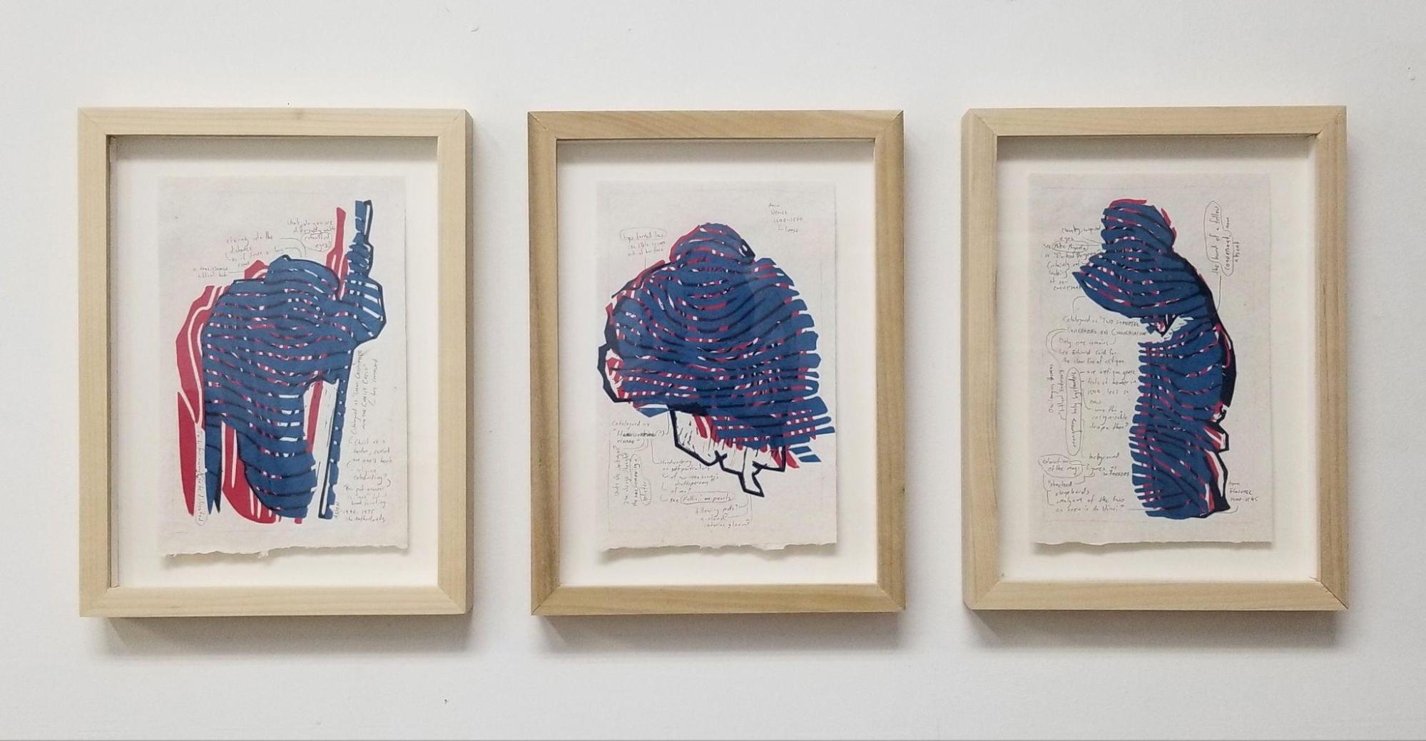
Each Triple Vision print reproduces a drawing by an anonymous Renaissance draftsperson. I'm particularly interested in the work of students, where we can more readily see these images as a form of practice. I was looking for figures caught in the act of close looking, so that looking can be our subject. I worked from digital reproductions of the source images, but when I selected a figure, I took pains to cut them out, leaving a jagged contour. For me, this rupture is key to any appropriation—the edge suggests the broader image and, in turn, the genre from which a component is cut.
From here, I translated the original figure into a single channel "key block" carved in linoleum—mostly composed of linework, relatively faithful to the original, and very graphic. It's cut like a traffic sign, designed to be highly visible and legible from a distance. At this stage, I was looking for big passages of value, repeating patterns of line, and other graphic short hands that help translate a pencil drawing into chisel marks in linoleum. This block is printed in a dark blue as the first layer in the image. I think of this as a second close-looking, a sequel to the work of the original draftsperson.
Next, I carved two additional blocks—
There are two idiosyncrasies to my printing process that are worth mentioning here. First, in a traditional relief process, the key block is either not printed in the final image, instead serving as a template by which to carve other blocks, or it is printed last to seal the image and confirm all the fine details that might be smothered by the color layers that came before. In my case, I've opted to print it first, meaning that all those specific details get covered and obfuscated by what follows. For me, this is where that screen between the viewer and the content of the image starts to develop—a scrim of supporting layers deployed as a barrier rather than cushioning the key block like a pillow. To reference another artist, for me this gesture recalls some of Arne Svenson's photographic work, where he focuses a super long range telescopic lens on the window of a building opposite his own, rather than on figures in the room beyond. The interface is put into focus, not the content beyond.
Second, rather than printing the blocks in a tight register, each interlocking with the next, I've opted to fan out the layers like a hand of playing cards. This serves two purposes. One, it leaves some hint of the key block to peek out in resolute clarity as a thread for the viewer to pull on to unravel the work. Second, it sets up a series of unpredictable interactions between the layers—passages that normally align instead interfere and vice versa. One of the main allures of printmaking for me is the opportunity to be surprised by my work when it comes out of the press. One of my graduate professors compared this to Gepetto, the old craftsman in Pinocchio, falling asleep at his table and waking to find his work has come alive.
There's also the matter of ink to discuss. Rather than using ink straight out of the can, in each layer I've mixed a custom blend of oil-based relief ink, oil paint, and tint base extender (an oil medium that increases the volume of ink without increasing the amount of pigment). Each layer is mixed with a little bit of transparency to it, so that when they are assembled together, you can peer through the surface layers into what lies beneath. Critically, the transparent magenta cannot compete with the dense blue of the key layer and almost disappears on contact, while the cyan has enough body to sit on top of the layers below.
Finally, I add the graphite annotations to each print. As discussed above, these serve a double purpose, both providing additional information to the interested viewer and acting as another visual layer between the viewer and the image within. I particularly want to call attention to the "false border" I've drawn around each image, a rectangle of graphite that echoes a window frame or the panel of a comic book. For me, motifs like that call attention to the surface. They are a way of saying "I know I've done some work here and I hope you will too."
So there you have it. There's more that could be said about drawing, paper, and installation, but these are the key moments for me at least as far as printmaking is concerned.
CM
I'll echo again. How does genre or medium factor into your account
of an artist's work? Do you often find yourself working through
comparison or do you tend to approach a work by itself?
RT
Historian Irene Small somewhat recently published a paper
“A-Specific Medium, Autopoietic Form” which took Rosalind Krauss’
Post-Medium condition and expanded her observations to account for
both contingent yet highly specific medium and variables of form
in a postmodern Deleuzean orientation. While I am not truly
enamored with the theoretical groundwork established by the work
of Deleuze and Guattari, Small’s argument represents a contingent
of contemporary and post-conceptual artists who create works which
are medium specific only in as much as the medium determines the
a-specificity of form. I find myself fairly media/medium agnostic
and believe each interaction determines the medium which is most
successful and more appropriate to represent a particular set of
concerns. That said, I do find my initial approach is inevitably
formalistic in its tendencies.
For example, if you’ll indulge my exercise, I’ll briefly talk through an excerpt of my first experience of your work, Triple Vision, to illustrate the initial encounter and what I’d likely convey to the reader:
... Entering the space one is confronted with a triptych of works on a white textured paper with rough edges exposed, mounted within clean, minimalist, light-hued wooden rectangular frames. From a distance, one cannot help but notice a ghostly pale blue figures emanating from what appears as inky, deep blue contours and magenta highlights reminiscent of 3-D cinema glasses echoing the three distinct tones that, when combined, produce a depth of field and the illusion of flattened images projecting into space. As one approaches these prints, the amorphous blurs begin to resemble the organic linearity of fingerprints then, human forms appear. Three figures, two facing inward, acknowledge each other while bookending a central figure facing forward. The vertical lines of the reddish hues suggest strangers emerging from the shadows, aware of another presence. The cyan layer’s horizontal linearity is reminiscent of comic animation mummies, cloth bands wrapping the body and unraveling as the other propels through space. In this precise moment, one is confronted with the decision to turn away or resolve to approach these shadowy figures with vaguely human form. Curiosity intervenes, and slowly, with apprehension, as one leans toward the frame it appears as if the central figure is staring back, not quite certain of the presence approaching. Subtle markings beckon, and one steps closer, inching toward the surface. Upon closer inspection, swirls of text surround these central figures. Dialogue? Conversation, perhaps. With whom? Whose words? These fleeting graphite lines of text, while scanning from left to right when read, follow no logical patterns. They orient themselves within a hand penciled boundary within which the figures are situated, but the text runs in all directions. Errant vertical bursts which defy reading syntax, instead running from bottom to top when words are read. Broken lines continue in text blocks which pillow the figures. Yet others follow the contours of the graphite blocks containing both image and text. There are oblique references to Edward Said, notable Christian imagery such as the adoration of the magi, and an eddy of an unknown maker’s provisional thoughts. Phrases are encircled and thin lines link to other portions of the text. Other times, the lines connect image to text. In a moment of shorthand, the handwritten annotations hold the place of an artist signature where it might traditionally appear on the surface of a print or drawing instead indicating the maker as “Anon.” and gesturing toward “Florence 1500-1545,” a distant place and geography. It is at this moment, in artist “Cameron Mankin’s” studio in Chicago in April 2022, one realizes both the appropriated images and these works remain unsigned...
Once I’ve established a visual narrative, I might start parsing details. Depending upon the audience and publication, I’ll describe installation and curatorial decisions to place the work within the display context, draw parallels to similar works either thematically, stylistically and materially, to place into context within art historic dialogues. In the case of Triple Vision, the artworks fit into the tradition of printmaking, but it could also be argued that these works extend conversations about drawing and installation itself, and I can pinpoint different works and moments within art history to illustrate each of those three arguments. My primary objective is to describe enough of the encounter an audience can begin to contend with the object itself, then I’ll scaffold different descriptive and theoretical frameworks in surrounding layers. I don’t have a pre-determined approach. The artwork—materials, subject matter, or both—dictates the process.
I hope this has illustrated a bit of my thinking around the subject of description in relation to image?
RT
I was wondering if you’d be willing to elaborate on what you saw
and experienced, perceptually, while creating Triple Vision. And,
extending the metaphor of screening and frames, can you describe
what it was you saw the first time I viewed Triple Vision during
our first studio visit?
CM
One thing I notice that we share is a desire to begin a
description with a character entering the room. In yours, the
viewer “enters the space.” For me, it so often has to do with
turning a corner or seeing a work through a momentary parting in
the crowd at a gallery. Whenever I look at art, I am looking for
that small glimpse of something on the horizon that in some way
defies ready description, something that prompts investigation.
In the process of making Triple Vision, I experienced a strange inversion of that glimpse. I took something known and added successive layers of distance to it. A print is such a flat work surface, millimeters thick if you count the paper, and when you include the distance to my head when I am working at a desk, as I often do, the distance only extends to a foot or two. In practice, I found myself pinning up the work so that I could view it from the far side of my studio, before returning to “close-looking” range. It was a curious sensation to get up and see the work a little more clad, a little bit less resolute each time I stood up. I suppose it is not unlike putting a letter in an envelope; you know its contents, but you maybe can access them by holding the whole thing up to a light.
I think our first studio visit really helped me crystallize the language of “screens” and “interference” that I now use to describe these works. Before I often thought of them as “submerged,” the figure being pushed back into the surface by the layers on top of them and by the cushion of text. For me it helps connect the work to texts like Alexander R Galloway’s “The Unworkable Interface” which presents the surface of the image as a work surface where viewers engage in the act of interpretation. It takes on a permeable quality, like a membrane, rather than being a flat accumulation of process.
RT
In relation to your earlier verbal gesture toward arrows that
point to a sign or provide the viewer with more discrete
instructions the closer they get to the artwork, I think about the
difference in approach of Charles Peirce and Ferdinand de
Saussure’s semiotic forms. While de Saussure’s dyadic model
provided for a Structuralist approach between signifier and
signified, which permitted for slippage between the experience and
the utterance—or image and text, Peirce posits a triadic
relationship creates the sign, suggesting the image-sign is
apprehended and comprehended through elements of mediation. These
two differing models have me returning to the notion of your
“false frame” and where one directs the viewer’s attention. I
suppose this becomes a question of the final word (or image).
Cameron, I cannot thank you enough for your generosity sharing
your vantage point. It’s been wonderful having this face to
face. In one final gesture, how do you feel about us
facing something together? Let’s have a look at our
reader-spectators, shall we?
[1] Although Krauss would break from the strictures of her mentor Clement Greenberg’s traditional Formalist approach to painting, instead expounding on the “post-medium condition” (A Voyage on the North Sea) or bristling against the art history of proper names and mythic modernist genius of a proper name (In the Name of Picasso), for example, Steinberg took an alternative approach (Other Criteria), departing from Formalist concerns completely, to address the socio-historic milieu of a work in an almost conversational form. While Krauss’ departure from Greenberg’s ideology would mark a new development in art historic discourse, she would later return to the more traditionally Modernist concerns of her mentor. Steinberg, on the other hand, would remain antagonistic toward the formalist doctrine of art criticism throughout his career.